

I hope you enjoyed last week's Mama Hog story. I realize it was a little long to be comfortably read on the blog, so I turned it into a Kindle ebook, changed the title, and put a cover on it.
I also made it free for the next four days. So, if you want a copy for your Kindle, just click here and grab a copy, no charge.
If you don't read on a Kindle, email me, and I'll send you a free copy in whatever format you prefer (PDF, Nook, or generic epub).
If you feel led to point your friends at this blog, I won't object to that at all, either, wink wink nudge nudge.
ABOUT THE COVER
No cover artist is credited in the ebook because I am the cover creator. If anyone is curious, I thought I'd divulge the steps behind the creation of the Knob Hill Haunt cover, because I do think it turned out pretty well.
I made this cover for a couple of reasons. First, this is a short story, not a book, and I couldn't see investing a couple of hundred dollars in it. Knob Hill Haunt is a title I entered into the Kindle Unlimited program, which means I can run free promos every 90 days, and Kindle users can also get it as one of their free reads anytime they have an open free-read slot.
My other titles aren't in the KU program. One of the restrictions is that a KU book can ONLY be sold on Amazon, and I'm not ready to accept that restriction for my other titles.
But, as a free introduction to Markhat and Darla's world, I decided to enter Knob Hill into the program, in the hope of picking up some new readers.
I made sure there were links to my other books at the end of Knob Hill Haunt. Yes, that is a shameless marketing ploy. Look, writers have to eat too.
But, if someone enjoyed Mama Hog's story, they might want to read the other books too. So I see it as a win-win.
All that aside, here's how I made the cover.
First, I searched for a suitable cover image. There are many stock image sites -- Shutterstock, iStockphoto, and Dreamstime, for instance. I tend to use Dreamstime; most of the opening images on this blog came from Dreamstime unless they were images or photos I created.
Here's the unaltered stock photo from Dreamstime:
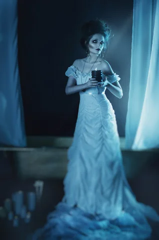
I bought a large image (3000 by 2030 pixels) because Amazon wants cover images that are at least 2000 pixels on one side. It cost me 11 credits, which is around 11 dollars.
I chose this image because it's spooky, it's pretty, and it fits a scene from the book. It's licensed for use on book covers. Also, the model is posed to the right side of the image, which left me room for text.
There are a couple of basic rules for book cover design. I'm sure there are. I don't know them, but here are the few things I do know:
- Never lay text over a face. Seriously.
- Apply the 'rule of thirds' whenever possible.
- Western readers move their eyes across a cover from left to right and along a diagonal from the upper left corner to the lower right. Yes, centered elements are also fine -- but if you can't center things, remember the left-to-right bit.
- The cover should still retain legible text when shrunk down to thumbnail size, which means it must be readable when it's only about 100 pixels tall.
- Ugly covers wind up on display at lousybookcovers.com. You don't want that.
I don't have Photoshop, which costs a billion dollars a copy. It doesn't, but it might as well. Too, Photoshop must be learned, and given my current age and lifestyle preferences I don't have that kind of time left.
I use Corel PaintShop Pro X9. It costs about 79 bucks, and while there is a learning curve it obviously isn't too steep because I run it just fine.
I put the image of the nice dead lady holding a candle on one layer.
I applied text on another layer. But let me back up a bit, and talk about text. Specifically, about fonts.
The fonts on your machine are free, and there are quite a few of them. But they're also bland and familiar, and nothing screams self-made cover like a title written out in Courier New.
Like images, fonts aren't usually just free for the taking. People work hard to create them, so you should pay just as much attention to the rights granted on fonts as you do to those of images.
Free font sites abound. I looked around until I found one that both fit the theme of my cover and was free to use, even as part of a commercial project.
I downloaded the font and installed it, and that gave PaintShop access to it.
I tried about a dozen fonts. All but two were rejected because they looked fine on the big image, but were illegible when reduced to a thumbnail. People aren't going to click on a book when the title can't be read, and I don't blame them one bit.
I put the title in the upper-left third of the book. I put my byline down at the bottom right. This way, the reader's eye moves like this: title, ghost lady, byline. The arrangement quickly lets potential buyers glean all they want to know from a book cover. It's about a haunting of some sort. The protag is probably female. A guy named Tuttle wrote it. All in a single glance.
I set the text color as white and then made the text layer partially transparent, so the blue in the image layer bled through just a bit. This made the letters look as though they were a part of the overall image, and not just stuck on top as an afterthought.
I applied some subtle shadows (light source from upper left of cover, which cast shadows down toward the right) behind the text, and then added a very slight distortion effect (wind, left to right) to add a hint of blur to the edges of the text.
Effects such as those only apply to the layer you've selected, so the lady wasn't blurred or windblown at all. It's rude to blow winds at ghosts. They enough to deal with.
Once I was satisfied, I merged the layers. Then I resized the large image to conform to Amazon's cover image standards.
That's all it took. I spent between six and eight hours, I think, on this cover. Most of that time was spent finding the main image, and then the right font.
This was a very simple cover. It involved no custom artwork -- by that, I mean no artist sat down and drew or painted a character from scratch. I used a single stock image and some text. The Markhat covers, which were created by ADsmith Marketing, involve multiple images and layers and Photoshop and, probably, quantum mechanics, which is why I left those covers to the professionals.
A truly custom cover, one that doesn't use stock images, is going to cost. A thousand crisp new dollars will probably buy you one. Artists don't work cheap, nor should they. One day I'd love to commission a genuine painting of Darla and Markhat, or Meralda and Mug and Donchen. If anyone out there is sitting on a bag of cash they find repulsive, send it my way, and I'll get started on that.
Next week, I'll explain how I turned the manuscript into an ebook.
Until then, take care!
Cover image credits: ID 76944122 © Olga Osadchaya | Dreamstime.com
